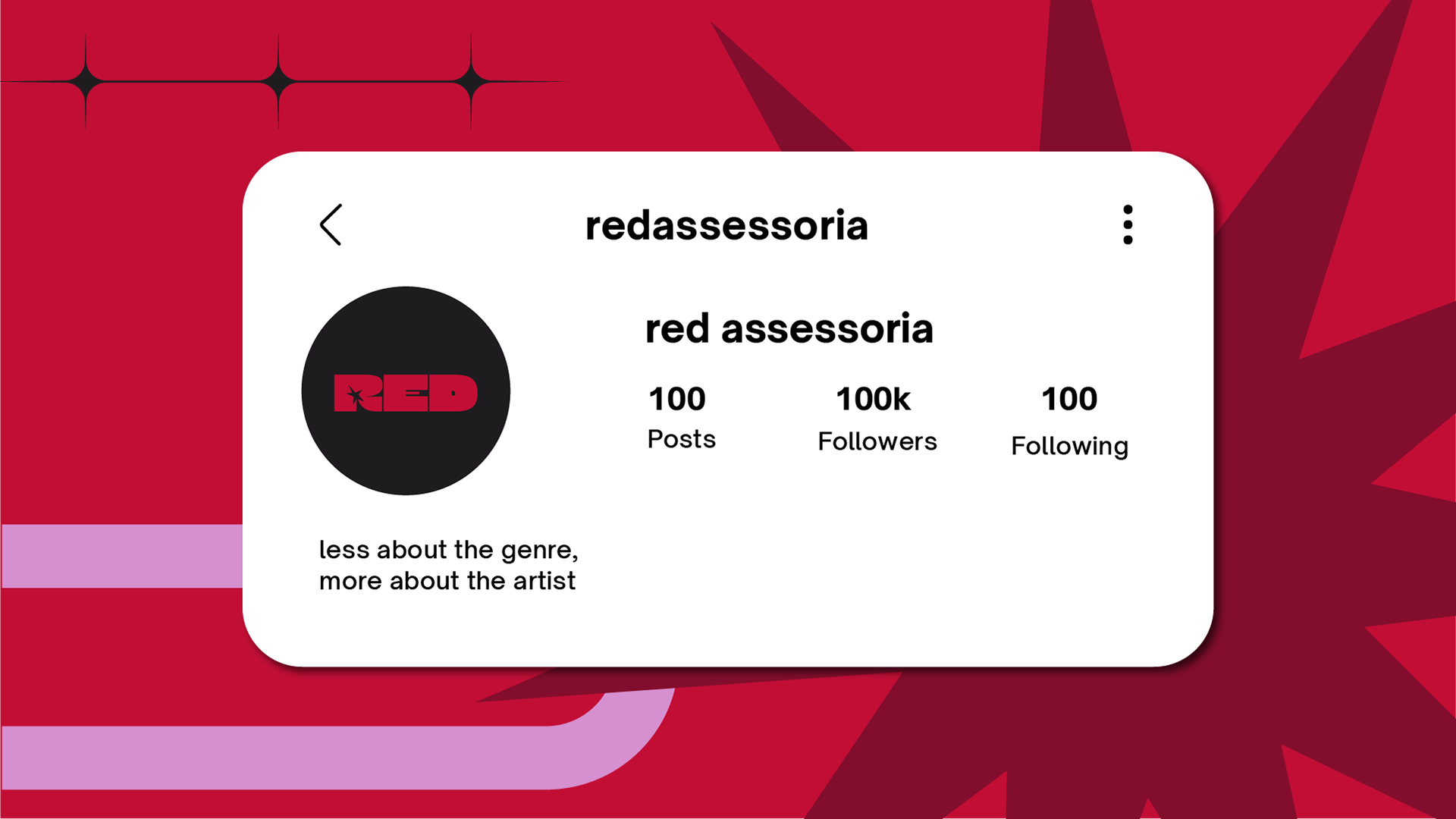
red assessoria is a PR agency focused on musical artists, that differents itself by viewing music as a plural art form, capable of manifesting in different formats, aesthetics and genres.
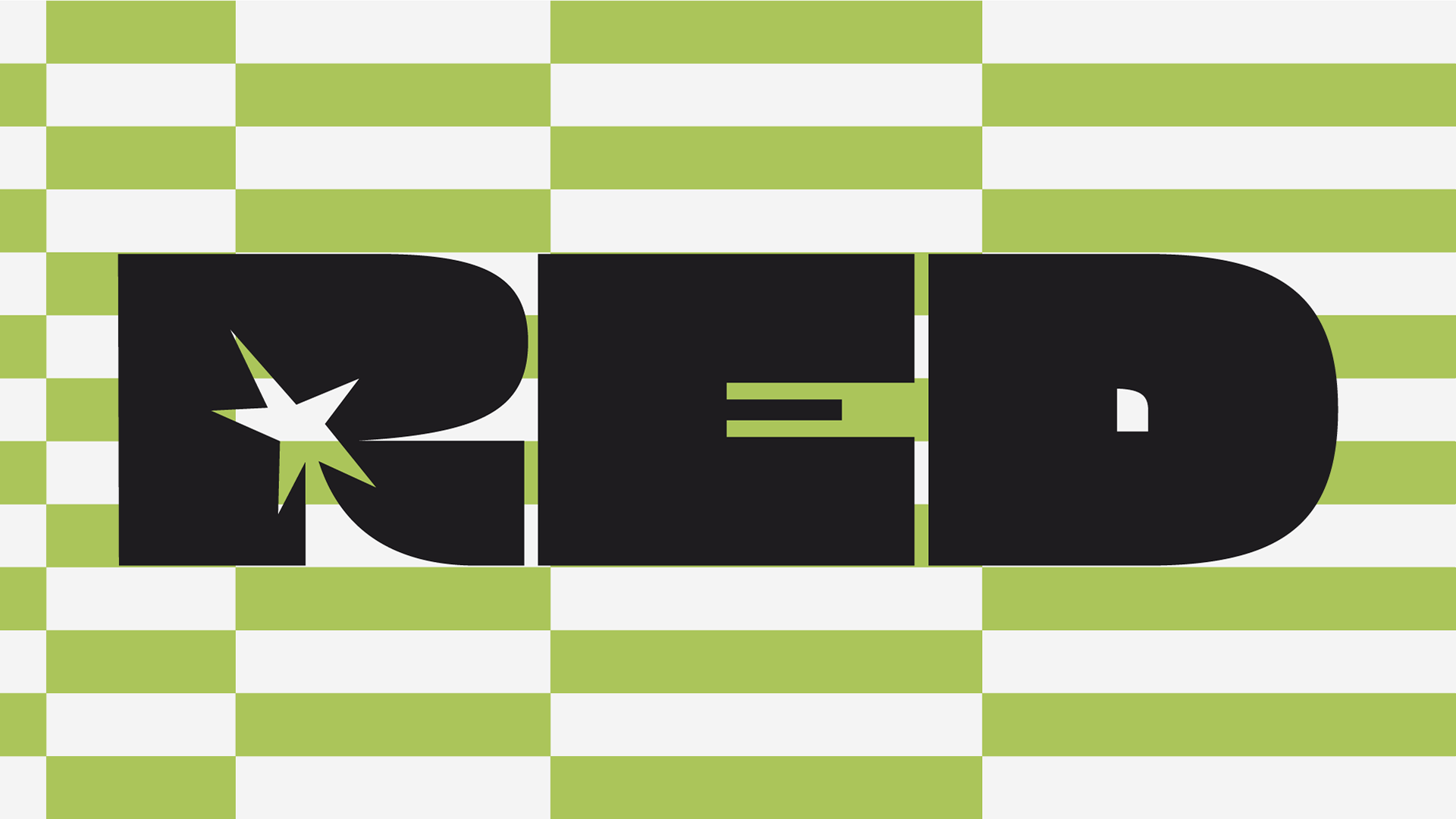
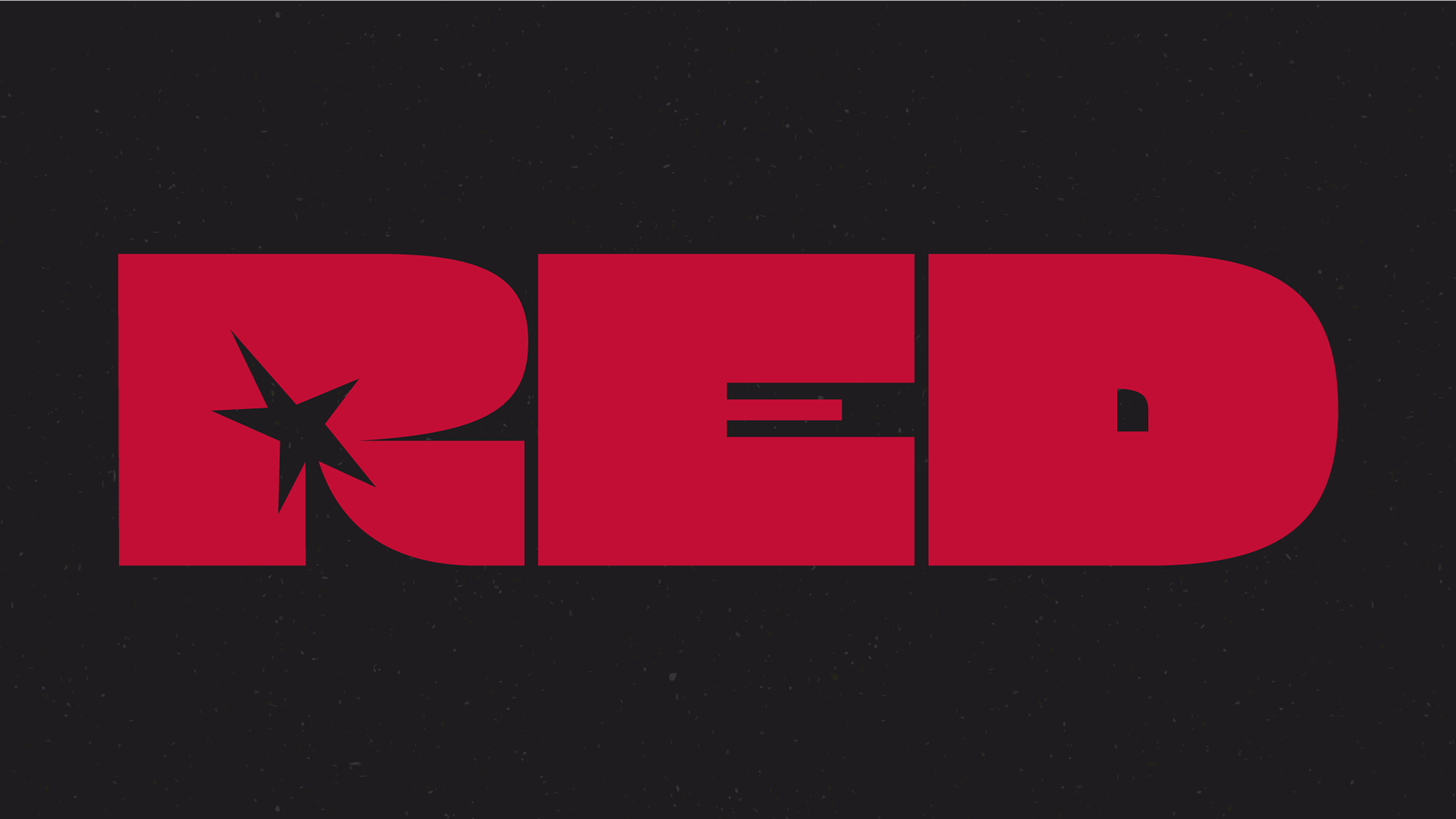
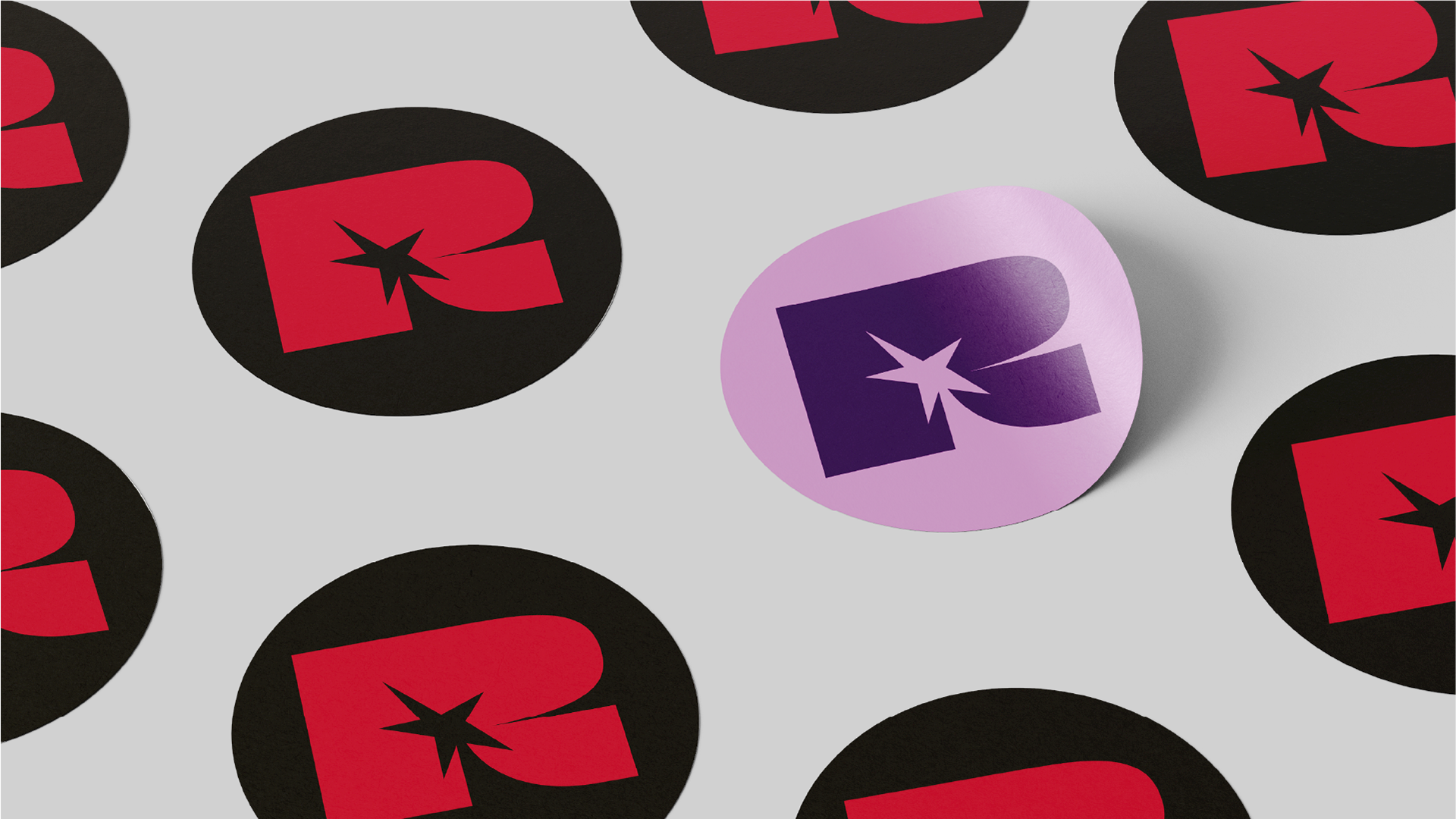
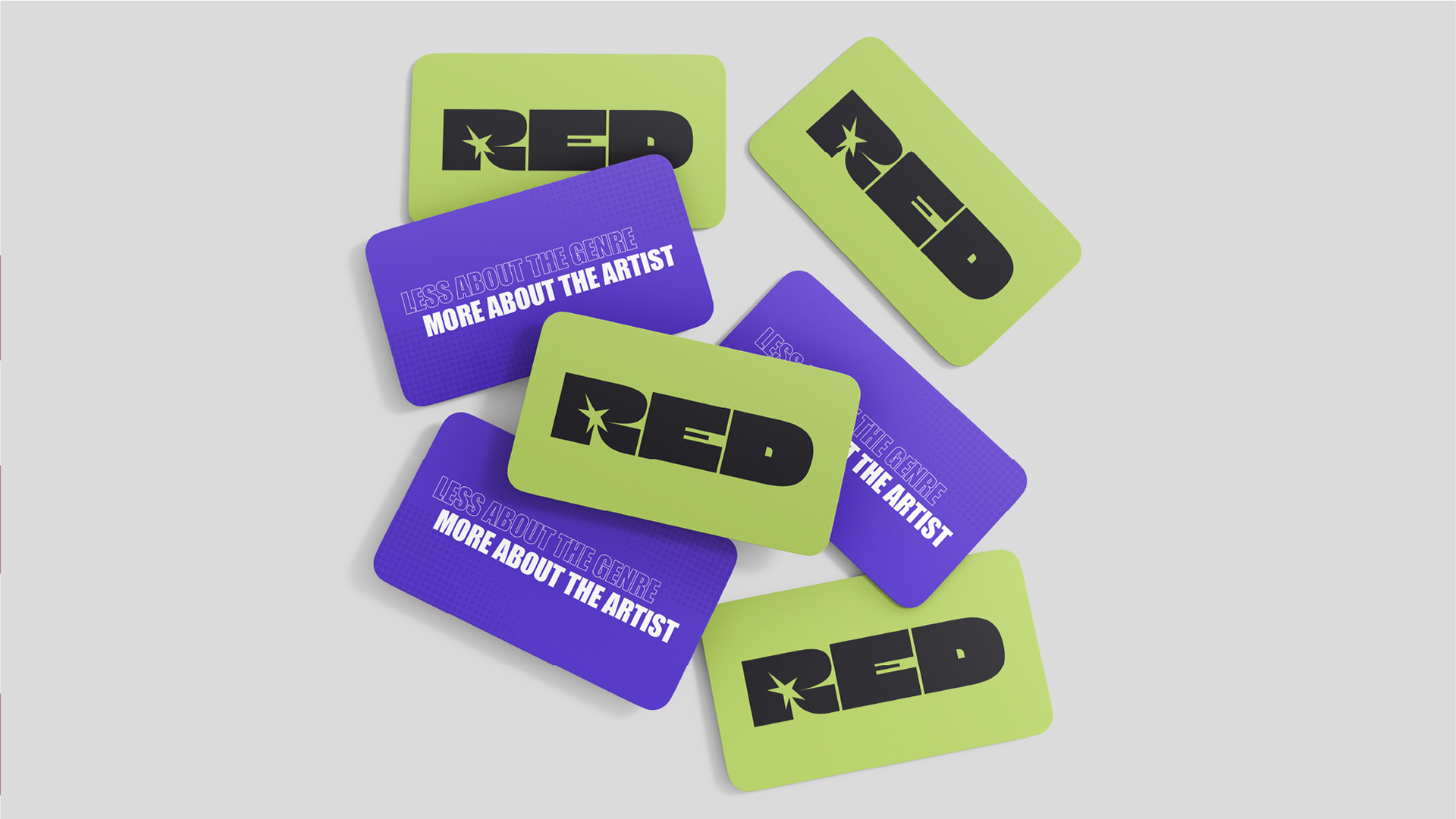
The logo was designed with a bold and expressive approach, seeking to convey presence and personality, and also refforcing the brand's positioning in an artistic and dynamic scenario.
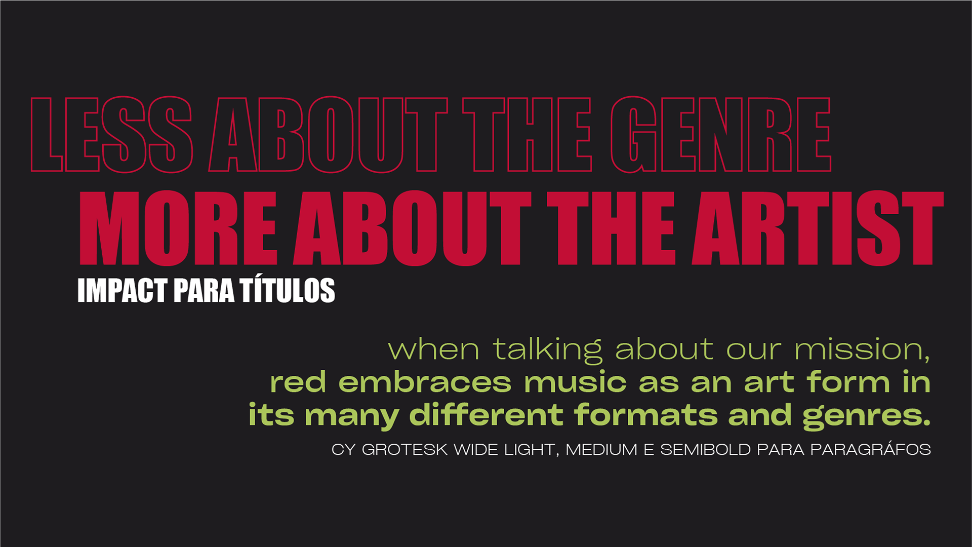
The typography is supported by the combination of the fonts "Impact" and "Cy Grotesk Wide", following a more outstanding line, contributing with the construction of a strong and modern visual identity. It directly dialogs with musical universe, bringing attitude and autencity to the brand's communication.
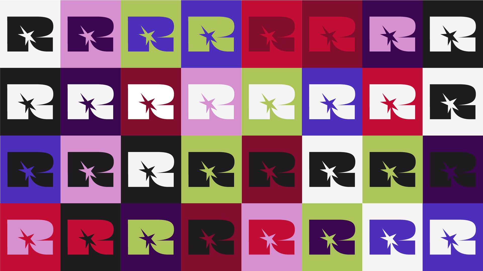
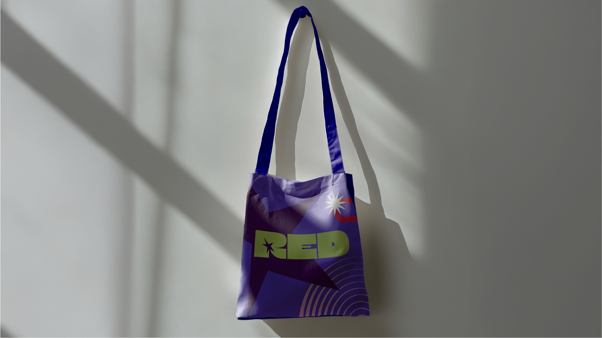
The visual elements are explored in an intentional and expressive way, creating dynamic compositions that reinforce the idea of movement, diversity and experimentation.
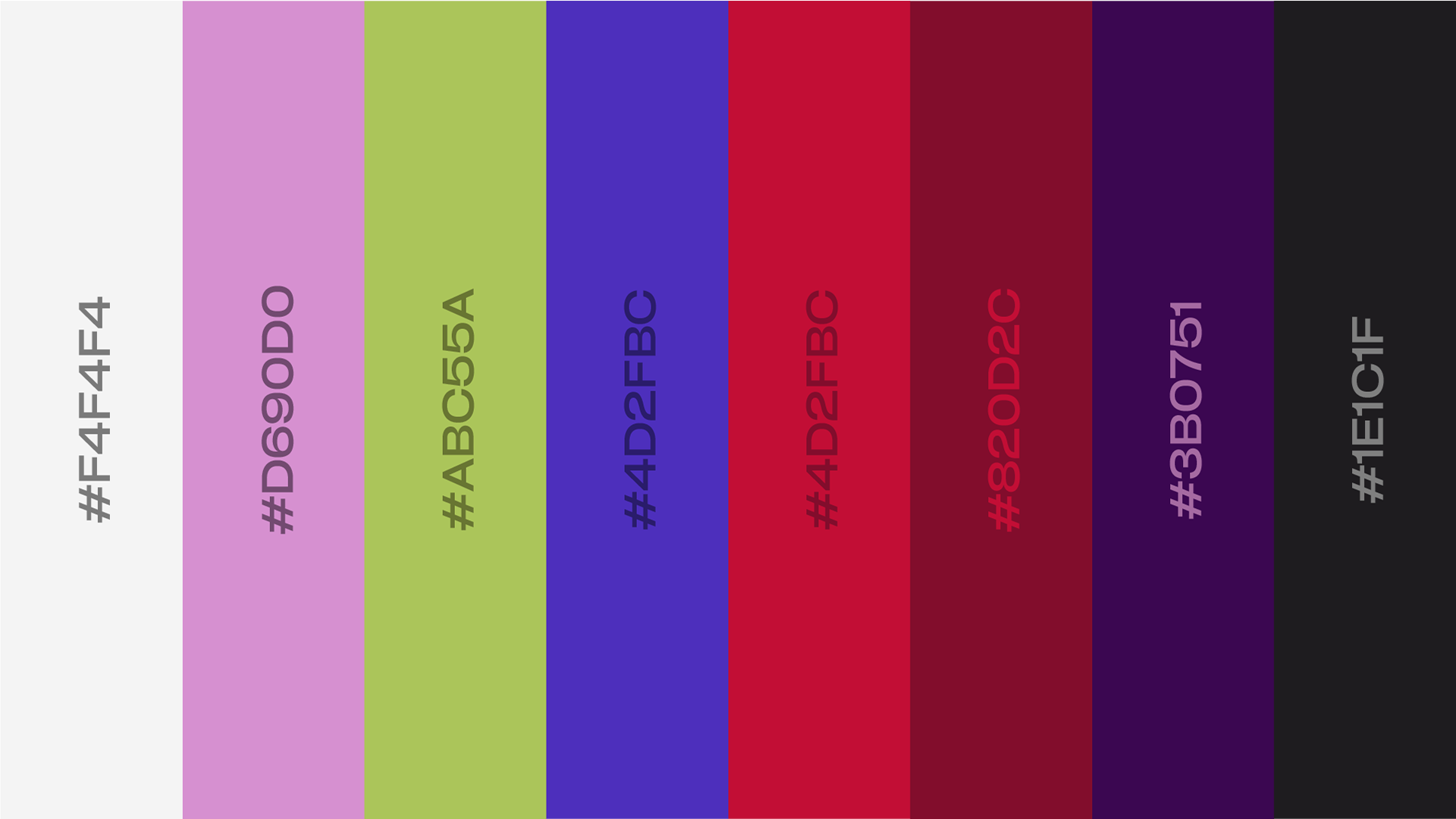
The color palette is vibrant and vivid, mainly guided by the color red, a direct reference to the agency's name. It was also designed to highlight the brand and translate its creative energy, besides strengthening the identity and ensuring high visibility in applications.


YEAR: 2026
CLIENT: RED ASSESSORIA
#VISUALIDENTITY #BRANDING #FREELANCE